Nirvana

Multi-Clinic Brand & Marketing System

ServicesBranding · Marketing · Print Design
IndustryHealthcare · Multi-Clinic Primary Care
Year2023
ClientNirvana Healthcare
(R)

Supported the evolution of Nirvana's multi-clinic brand system across print, digital, social, patient education, and in-clinic materials.

My work helped create consistency across a growing healthcare network of 12+ locations while preserving the identity of individual partner clinics — turning a fragmented set of practices into one recognizable brand.

Key Contributions Multi-location brand system · patient education materials · social and print campaigns · in-clinic environmental design · brand guidelines · campaign systems
(01)

A unified brand voice across 10+ primary-care clinics in New Jersey, each with its own community character.

Nirvana Healthcare is a network operating more than ten partner clinics across New Jersey — primary care and specialty practices serving multi-ethnic communities from Newark to North Ward. Each clinic had its own history, its own patients, and often its own signage and brochures.

The work was a yearlong design partnership with their marketing team: a single visual system that reinforces the Nirvana parent brand at every patient touchpoint, while letting each partner clinic preserve its identity. Logos, marketing materials, patient education, online reputation — all designed to make a multi-location network feel like one trusted family.

(02)

The tree-of-life logo became the connector — a mark that holds the entire family without erasing any individual clinic.

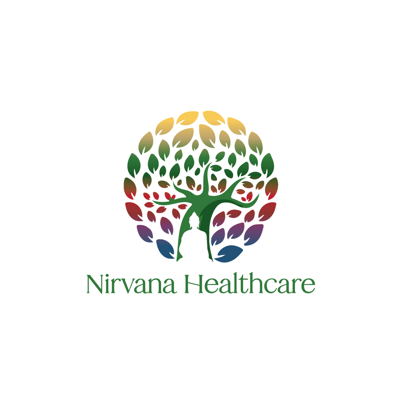
The Nirvana tree-of-life logomark — multicolored leaves arranged in a circle, a meditative silhouette under the canopy — carries an unusual amount of brand work. The leaves' color diversity reads as the patient population. The Buddha-like figure reads as the brand name's meaning. The forest green grounds it in primary-care reliability.

Every patient-facing surface — appointment cards, disease-education booklets, social posts, partner co-branding — uses the same lockup in the same position. The system flexes to accept partner-clinic marks above the Nirvana wordmark, so each location keeps its name without losing the parent brand's trust.

Nirvana Healthcare social media — three iPhone mockups showing North Ward Behavioral Health (TMS), Sinus Infection Tips, and Roosevelt Medical Society Migraine card
(03)

A three-tone primary-care system. Nirvana forest green carries the institutional anchor across every clinic. Jade accent provides a softer secondary for highlights and call-outs. Signal white grounds the brand in clean, welcoming space.

Nirvana Green #528864
Jade Accent #669E7A
Signal White #FFFFFF
(04)

The tree-of-life mark anchors the system. The forest-green serif wordmark sits below or beside it. The supporting layout grid uses generous white space, soft hairline rules, and a single accent moment per piece — a green call-out band, a colored chart fill, a botanical illustration.

Nirvana Healthcare tree-of-life logo with multicolored leaf canopy and meditative figure
Nirvana Healthcare business cards
Nirvana Healthcare business cards alternate layout
(04b)

Three brand-defined colour applications. Lockup proportions hold across every surface — black, brand colour, and light backdrops.

Nirvana logo in white on black — knockout variant for dark surfaces
01On Black
Nirvana logo in white on Sage Green — primary brand-colour variant
02On Sage Green
Nirvana logo in brand colour on light backdrop — reverse variant
03On Light
(05)

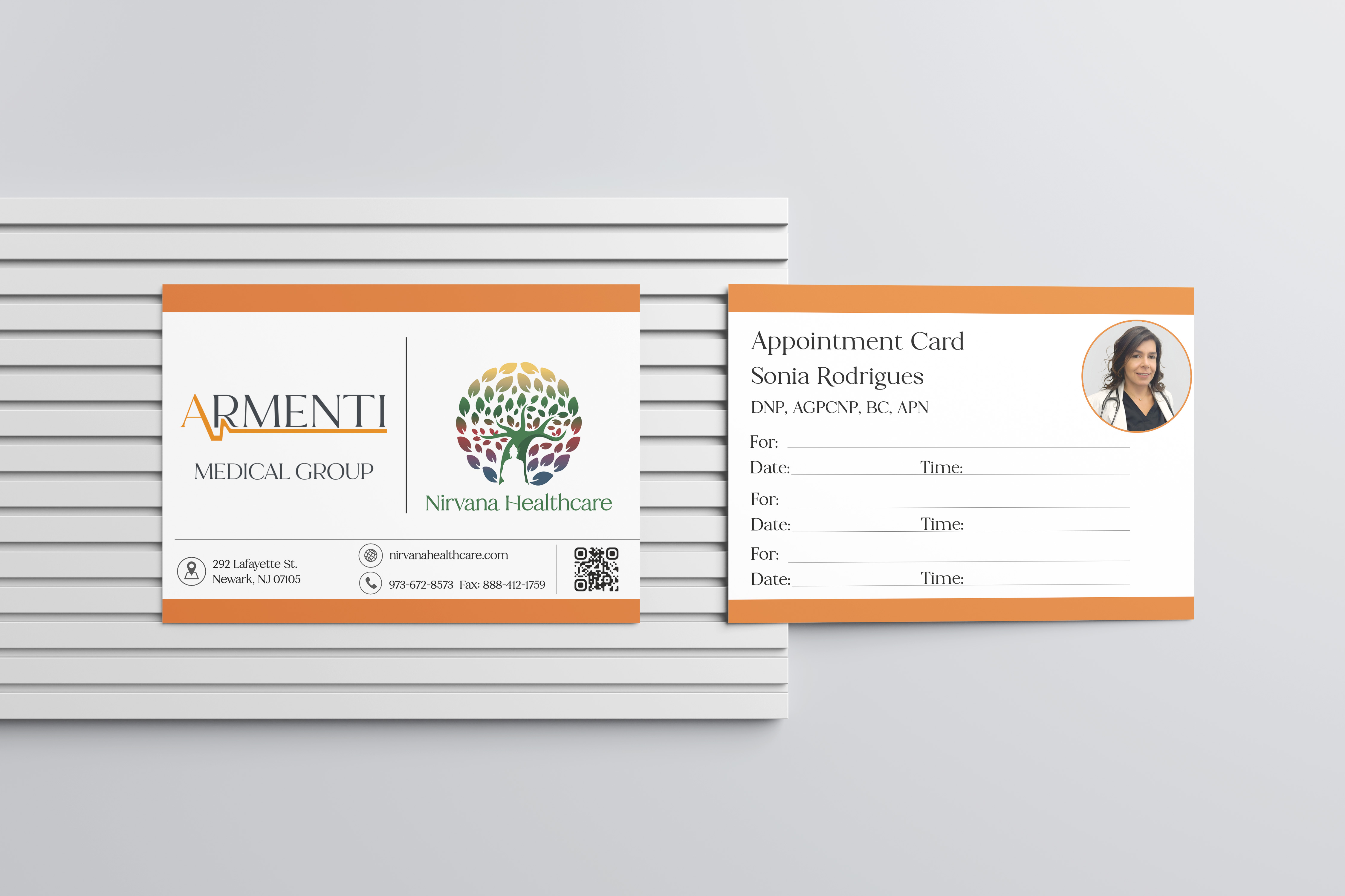
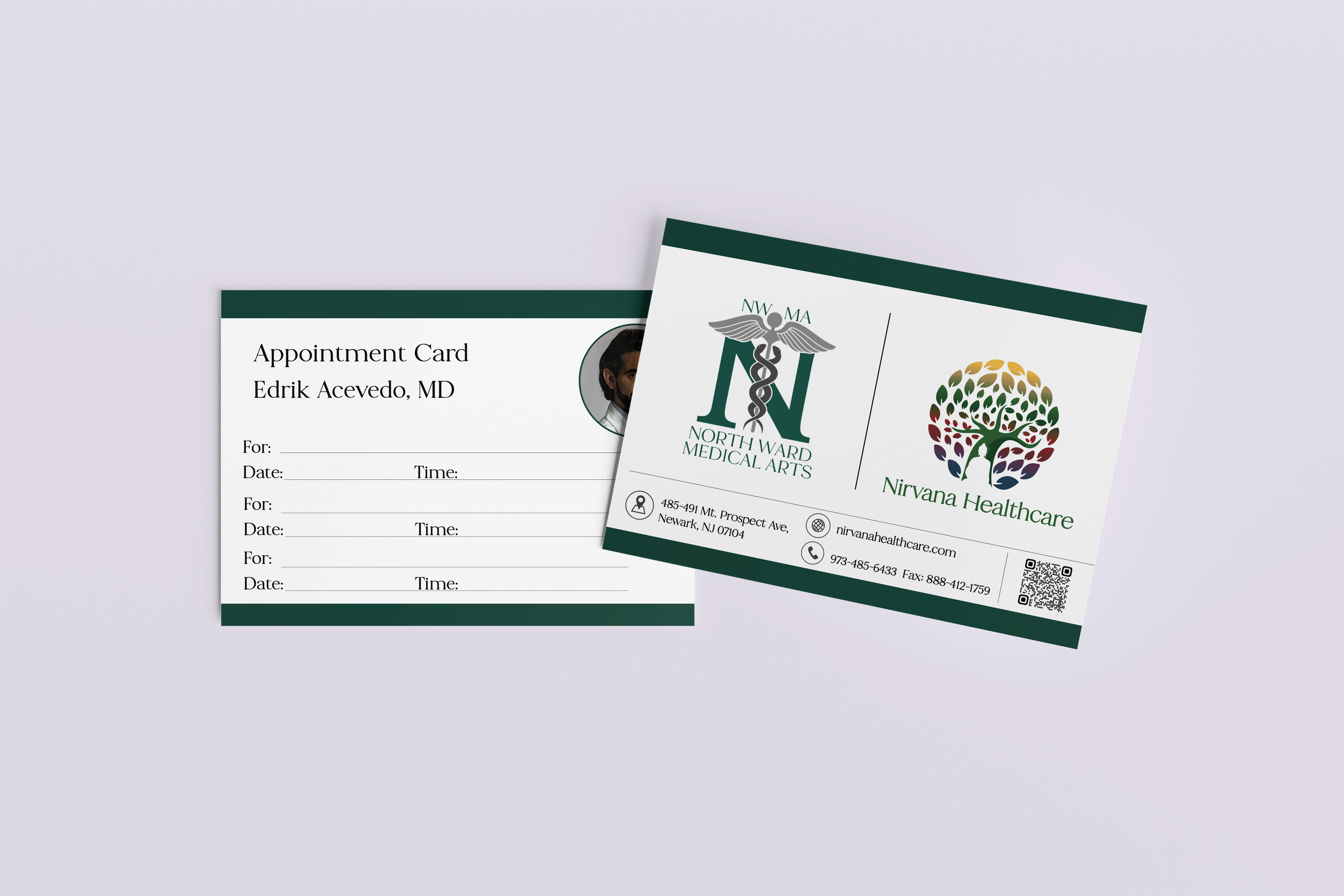
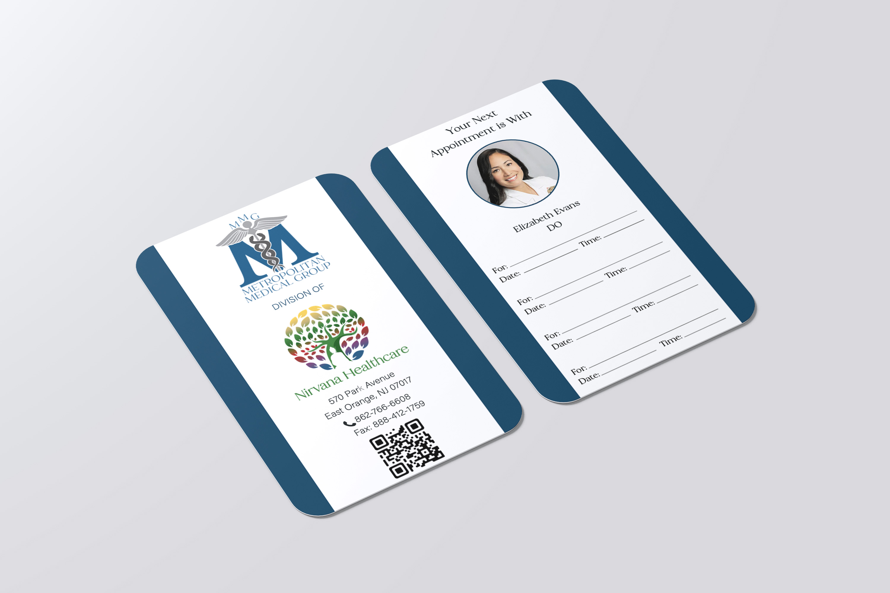
Trifold brochures introduce new patients to the network's primary-care services. Appointment cards reinforce the same visual language every time a patient leaves a clinic with a follow-up. The pattern at the bottom of each surface — a layered abstract leaf motif — pulls directly from the tree mark.

Nirvana Healthcare booklet covers with partner-clinic monograms
Nirvana Healthcare trifold brochure — Your Path to Complete Wellness
Nirvana appointment cards
Nirvana appointment cards alternate
Nirvana appointment cards stacked set
(06)

Disease-specific booklets translate clinical information into something a patient can read at the kitchen table. Diabetes lifestyle guidance, Qutenza treatment information — each book uses the same chapter grid, the same callout color rules, the same paper stock. Familiarity itself is part of the care.

Diabetes patient education booklet cover
Diabetes booklet interior spread
Qutenza treatment patient booklet cover
Qutenza booklet interior spread
(07)

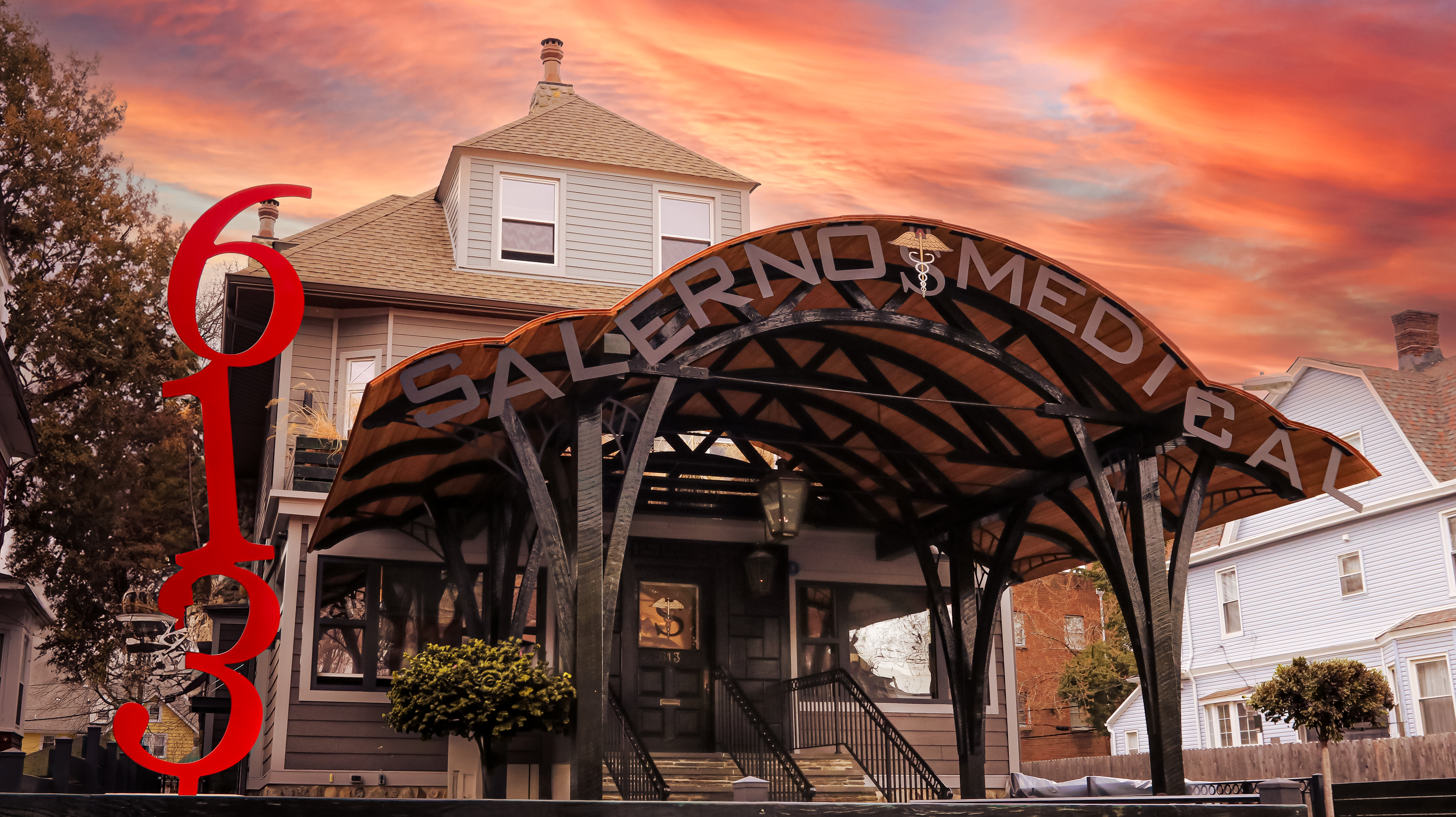
The brand extends from print into the actual clinic environment — exterior signage, interior wayfinding, and the welcoming spaces patients first encounter. Each location reads as part of the same family the moment a patient walks through the door.

Nirvana Healthcare clinic storefront at mid-morning — clean white stucco façade with warm-oak slat canopy, dimensional tree-of-life mark + Nirvana Healthcare green script wordmark above the entrance, PRIMARY CARE PRACTICES · 523 PARK AVE subhead, frosted-glass entrance with patient hours decal, kelly-green wayfinding flag-banner on the lamp post
Nirvana Healthcare patient welcome packet flat-lay — white folder with full-color tree-of-life mark and Nirvana Healthcare green script + Your Path to Complete Wellness bar, personalized Dear Mr. Chen letter, kelly-green Patient Handbook, Dr. A. Salerno business card, white-and-stainless premium pen, plastic appointment card TUE NOV 12 9:30 AM for MR. CHEN, white Rx Sample Pack bottle, surgical mask in sealed packaging, on a warm cream surface
(08)

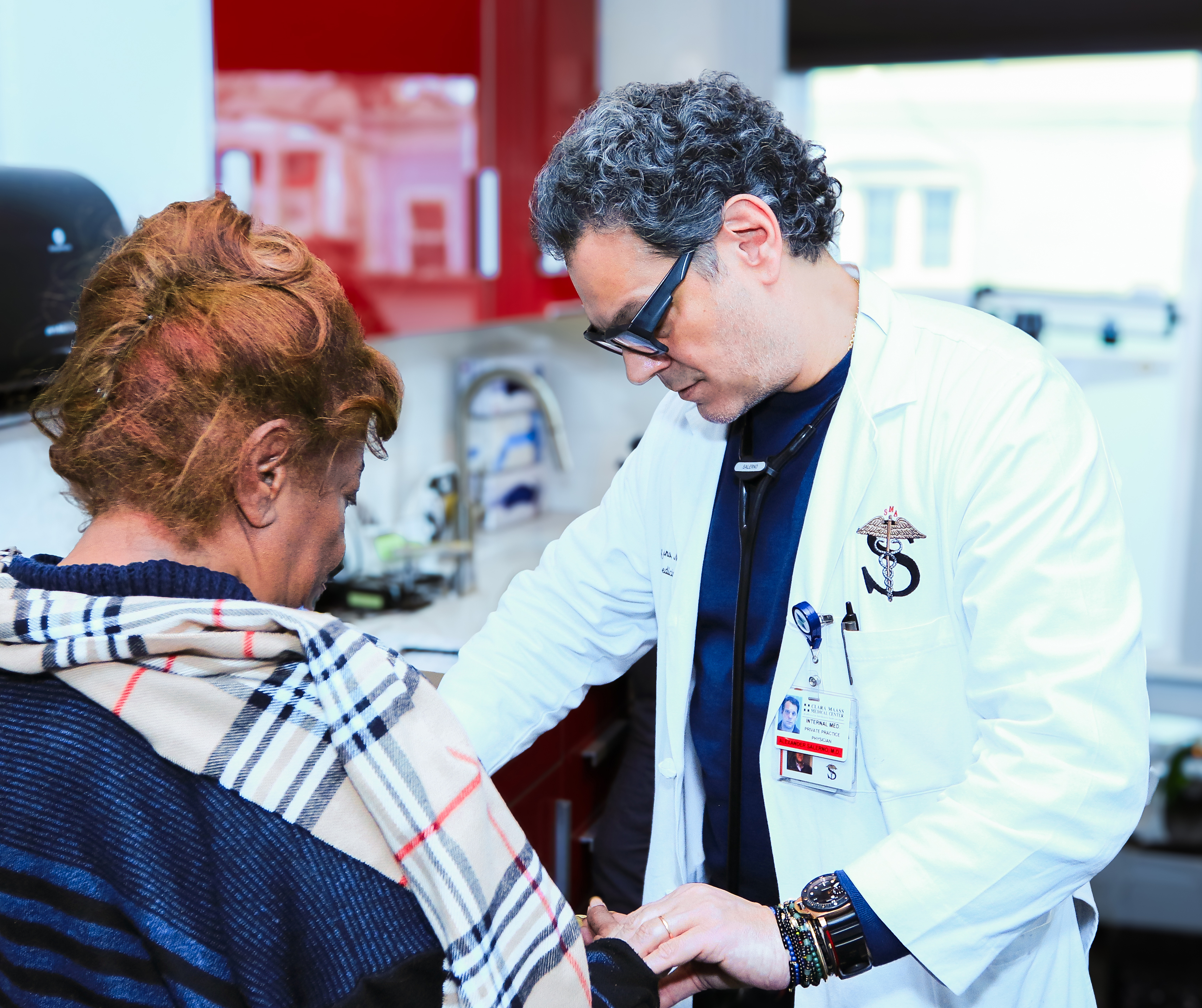
The work the brand exists to support — real doctor-patient relationships across the network. Editorial photography taken on location at partner clinics, supplementing the brand library with humans-first imagery that doesn't read as stock.

Nirvana Healthcare premium primary-care exam room — modern upholstered exam table with brushed-stainless base, kelly-green Nirvana Healthcare wall sign in script, framed tree-of-life mark with PRIMARY CARE lettering, oak shelf with stethoscope and blood-pressure cuff, branded brochure stack on a slim oak cabinet, white peace lily by the window
Nirvana Healthcare in-house pharmacy — warm-oak slat counter face with PHARMACY in kelly-green dimensional sans, cream travertine countertop, white shelving with eight bays labeled ANTIBIOTICS / BLOOD PRESSURE / CHOLESTEROL / DIABETES CARE / PAIN MANAGEMENT / VITAMINS / WOMEN'S HEALTH / MEN'S HEALTH, branded Rx prescription bag on the counter with stainless pill tray and weighing balance, tablet computer with Nirvana wordmark
Nirvana Healthcare on-location editorial photography
(09)

The network's 10+ clinics each retain a partner-brand identity that sits alongside the Nirvana parent mark. The system holds whether the partner is a behavioral-health practice, a regional medical society, or a long-standing community clinic.

Northward partner clinic logo
Armenti partner clinic logo
Nirvana Healthcare master brand logo
Nirvana Healthcare flyer using the partner-network brand pattern
Typography

Nirvana

AaBbCc · 0123456789

DisplayGeneral Sans · Semibold · 64–144pt
EditorialFraunces · Italic accents
VoiceClear · trustworthy · steady
Tracking-0.02em display · 0.12em UI caps
(End)

Your Path to Complete Wellness