Nirvana Web

Patient Acquisition Website Redesign

ServicesWeb Design · UX Strategy · Responsive
IndustryHealthcare · 12+ Clinic Network
Year2024
ClientNirvana Healthcare
(R)

Led the visual direction and UX redesign for Nirvana's multi-location healthcare website, turning it into a real patient acquisition channel.

I shaped the page hierarchy, location-finder experience, mobile conversion flow, trust signals, and responsive design direction — translating the brand's physical clinic experience into a premium digital system built to convert.

Key Contributions Brand-aligned web direction · UX structure · mobile-first conversion strategy · location explorer · trust-signal placement · responsive layout system

(01)

A premium digital identity for a healthcare network that had grown faster than its website.

Nirvana Healthcare grew from a single clinic in Newark to a network of 12+ locations across New Jersey — but the digital presence hadn't kept pace. The existing site ran on a dated WordPress template that read more strip-mall than the Victorian-architecture sanctuaries the brand had become known for.

The redesign goal was straightforward: make the website feel like walking into one of their actual clinics — warm, professional, distinctly premium. Cinematic photography of the buildings, sepia-tone editorial portraits of the founders, a sage-green system that signals "real medicine" rather than "another startup."

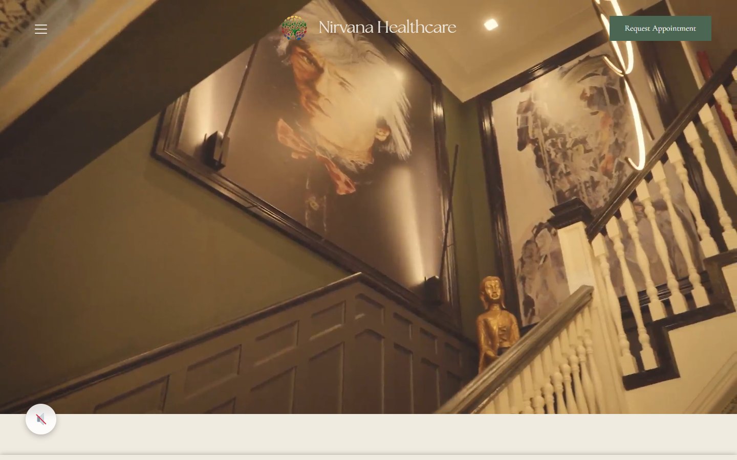
Nirvana Healthcare homepage hero on an iMac on a Victorian doctor's desk — the current site's Victorian-staircase hero with real sepia family-doctor portraits framed on the sage-green wall, brass Buddha figurine on the landing post, cream header with green Request Appointment pill; vintage medical reference books (Practice of Medicine, Gray's Anatomy, Merck Manual), brass banker's lamp with green glass shade, leather notebook with brass magnifying loupe, framed sepia portrait, brass desk clock, cream porcelain teacup; photoreal neutral daylight
(02)

Anchor the brand in its history. Then build every patient journey around the building they walk into.

The homepage opens on Dr. Alphonse Salerno — the founder — in a cinematic sepia treatment that establishes legacy in the first scroll. From there the site becomes architectural: real photography of the Victorian houses each clinic occupies, hand-set in editorial serif, framed in cream and sage.

The redesigned site treats every touchpoint — appointment booking, location-finder, service pages, press features — as part of the same physical sanctuary. Trust signals (ACR / IAC accreditations, U.S. News, podcast features) sit prominently in the body, not buried in the footer.

(03)

A three-tone web palette adapted from the parent brand. Sage green tightens the parent's forest hue for digital legibility. Cream warmth replaces stark white. Charcoal type holds the editorial weight.

Sage Green #4B6653
Warm Cream #EEE9DF
Charcoal #1F1F1F
(04)

The homepage scrolls as an editorial story. Founder portrait opens. "Tailored Care in a Tranquil Environment" introduces the sanctuary concept against Victorian-architecture photography of the actual clinic buildings. Each section moves the patient one step closer to a booking decision.

Homepage hero — Dr. Alphonse Salerno founder portrait in sepia
Homepage second section — Tailored Care in a Tranquil Environment with Victorian clinic photography
(04b)

Three brand-defined colour applications. Lockup proportions hold across every surface — black, brand colour, and light backdrops.

Nirvana-Web logo in white on black — knockout variant for dark surfaces
01On Black
Nirvana-Web logo in white on Deep Sage — primary brand-colour variant
02On Deep Sage
Nirvana-Web logo in brand colour on light backdrop — reverse variant
03On Light
(05)

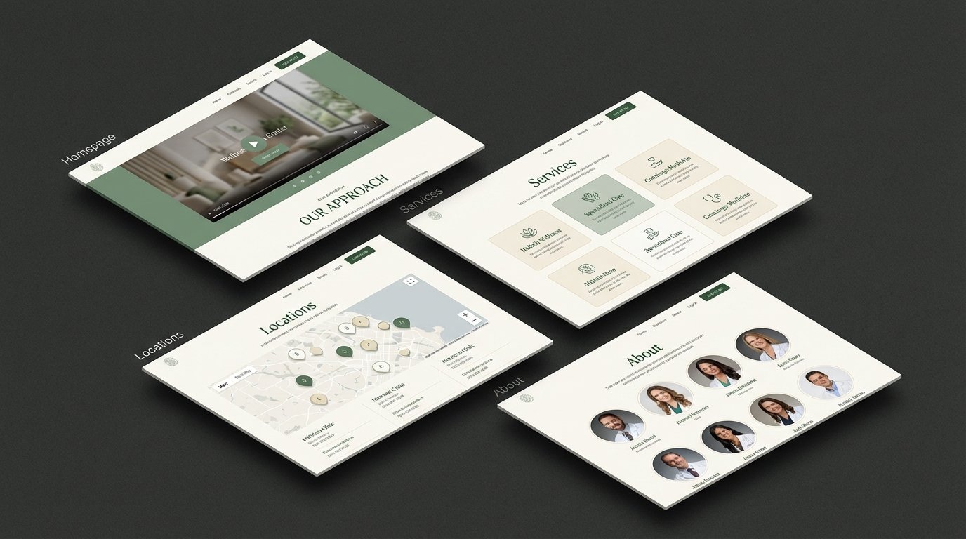
With 12+ clinics across New Jersey, the biggest UX challenge was finding the closest one fast. The redesign introduced an interactive vertical-tab explorer — each clinic with photography, descriptions, and direct booking. The path from "I need care" to "appointment confirmed" went from 4 clicks to 1.

Location explorer section on homepage
Dedicated Locations page top
(06)

Healthcare runs on trust. The redesign weaves credibility throughout the experience: branded patient testimonial cards, accreditation badges from the American College of Radiology and the Intersocietal Accreditation Commission, press features, and a dedicated "Why Nirvana" section that frames the brand as warm authority rather than corporate provider.

Why Nirvana section mockup with green testimonial cards and accreditation badges
Trust signals section
Patient testimonials section
Patient testimonials mockup with sage-green cards
(07)

Every page traveled the same three steps: a fast pencil sketch to lock structure, a disciplined grayscale wireframe to validate hierarchy, and the full-color final layered onto the same grid. Holding the process visible kept the redesign honest — no decoration without a layout reason underneath.

Three printed page proofs pinned to a sage-green linen pinboard above a Victorian-era walnut studio desk — left is the pencil sketch with handwritten margin notes, middle is the grayscale wireframe v0.3, right is the full-color final v1.0 showing the Victorian-staircase homepage with the provider grid; banker's lamp with green glass shade and open vintage doctor's notebook with process notes in the foreground
(08)

The services section organizes Nirvana's comprehensive care lineup — primary care, behavioral health, vein and vascular treatment, women's wellness — into a scannable card grid. The About page grounds the brand in its mission of disrupting healthcare disparities, in the same cream-and-sage editorial system.

Services page top
About page top
(09)

A dedicated press section surfaces Nirvana's media coverage — podcasts, news features, published articles — positioning the network as an industry authority rather than another local provider. Accreditations sit prominently in the body, where patients actually read them.

Press features section
Authority and accreditation section
Pre-footer content section
(10)

Over 60% of Nirvana's traffic comes from mobile. The responsive system prioritizes mobile conversion: persistent CTAs, tap-to-call, streamlined navigation, fast-loading imagery. The premium aesthetic holds from a 27-inch monitor down to a 5-inch phone screen.

Three mobile screens — hero, scroll, and detail showing the responsive mobile experience
(11)

The redesigned site moved Nirvana Healthcare's digital presence from functional-but-forgettable to competitive advantage. The location explorer reduced the average path to booking from 4 clicks to 1. The premium visual direction now matches Nirvana's growing reputation — featured in U.S. News & World Report and Healthcare Business Review.

About page mockup
Contact page
Typography

Care, redesigned.

H1 48 / 56 · H2 32 / 40 · Body 16 / 24

H1General Sans · Bold · 48–96px
BodyGeneral Sans · Regular · 16/24 rem
NumericsTabular nums for medical data
VoiceDirect · accessible · digital
(End)

Tailored Care in a Tranquil Environment