Wellness Brand & App Identity System
Built the visual identity and app design system for a wellness brand entering a category dominated by sameness.
I owned the wordmark, in-app type and motion language, marketing site direction, and the social/collateral system — translating a calming product into a brand that feels confident, modern, and trustworthy across every surface.
Key Contributions Brand identity · app UI direction · wordmark · social system · marketing site · launch collateral
A vibrant identity for a mindfulness app that refuses to look like every other mindfulness app.
The word becalm means to leave a sailing vessel unable to move through lack of wind — a state of absolute stillness. That definition became the foundation: a brand built around pausing, breathing, and finding inner calm in a world that never stops moving.
The mindfulness category defaults to mint pastels and mountain monochromes. BeCalm took the opposite move — a saturated sunset-to-night gradient palette that signals warmth and intensity, not corporate-spa restraint. Stillness as something vibrant, not muted.
Repetition as the architecture of calm — the circled arrows around the C mark the daily return.
The logomark frames a clean letter "C" inside two encircling arrows — the act of returning to calm again and again. Like a habit, like a breath. Training the mind is consistency, not crisis. The mark reads as both ritual and reset button.
The palette is psychological. Soft warm pink at the top — first breath of morning. Deep purple in the middle — the focused interior. Navy at the base — the depth that rest reaches. The full gradient is the brand's signature, applied across product packaging, billboards, and the app's most important moments.
A four-stop gradient is the identity itself — not background decoration. Vivid purple anchors the system. Soft pink lifts it warm. Deep navy grounds it. White carries every callout.
A clean sans wordmark paired with the circular-arrow C mark. The app-icon variant uses the same C inside a pink-to-orange gradient tile that reads instantly on a home screen full of color-coded competitors.
Three brand-defined colour applications. Lockup proportions hold across every surface — black, brand colour, and light backdrops.


The brand lives where the practice does — a quiet corner, a single candle, the few minutes a user carves out before the day starts. BeCalm sits inside that small ritual, not on top of it.
The app reads as visual breath: clean layouts, generous whitespace, the gradient palette appearing only at meditation moments where intensity belongs. The experience extends seamlessly to Apple Watch for on-the-go mindfulness, and the website mirrors the same calm-but-vibrant tone.
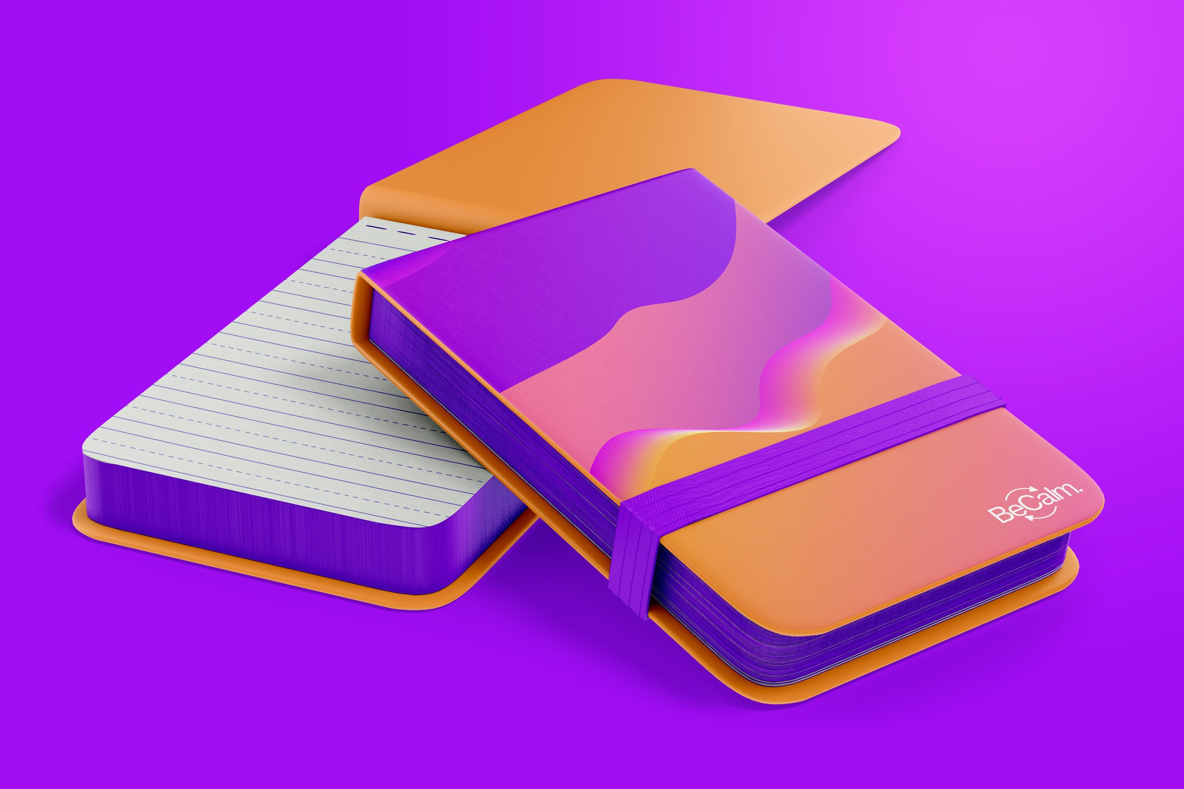
A limited-run physical companion to the app — kraft carton with hot-foil gradient C-icon, linen meditation cloth, branded oil mister, guide booklet, plum silk sleep mask. Premium drop, not gift-shop merch.
The brand at architectural scale — a partnered wellness-studio lobby with the BeCalm wave-mountain gradient wrapping a compound-curve feature wall, the C-icon at hero scale as a dimensional edge-lit installation, brushed-rosegold "Find your stillness." tagline set into the wall.
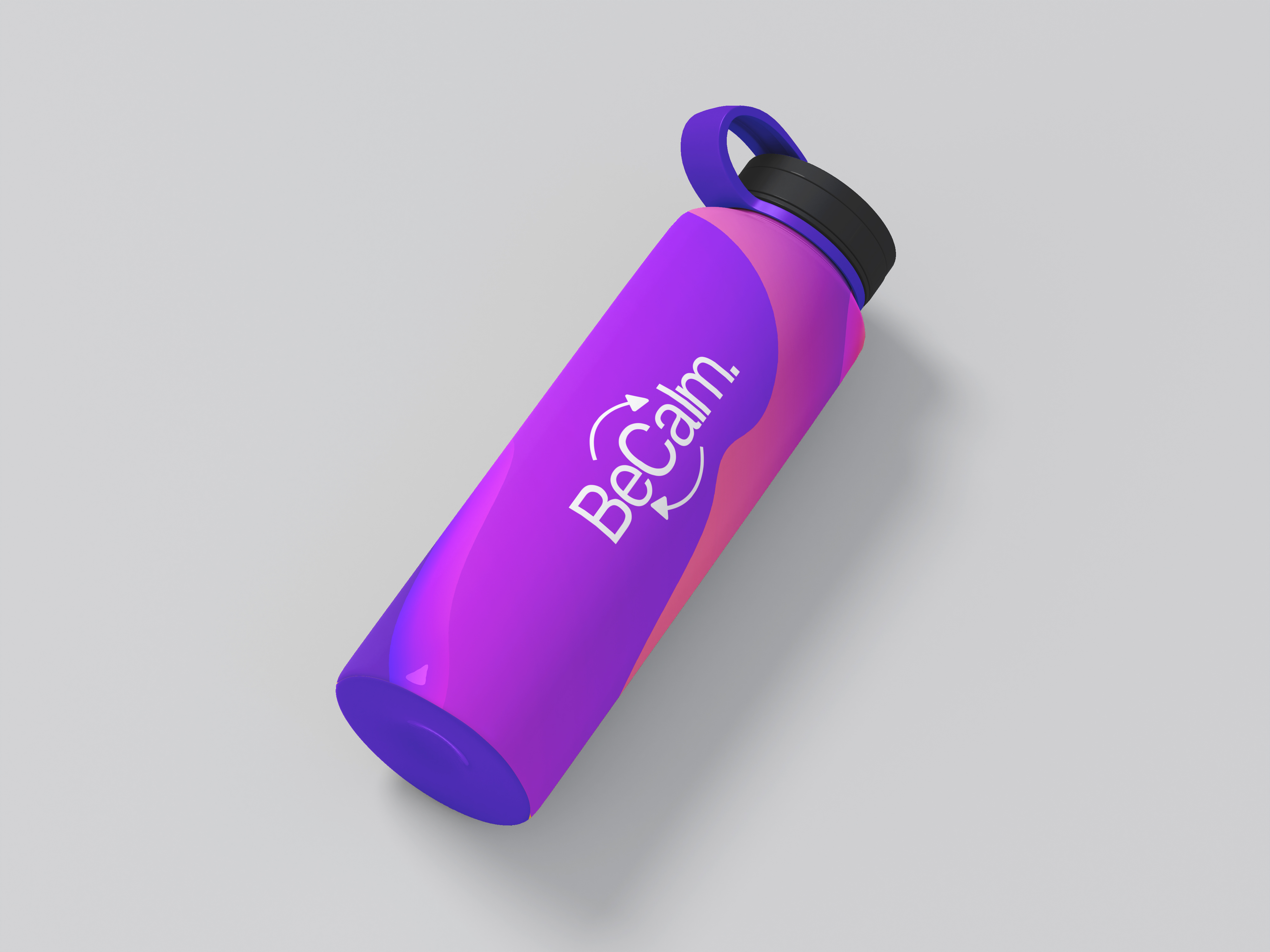
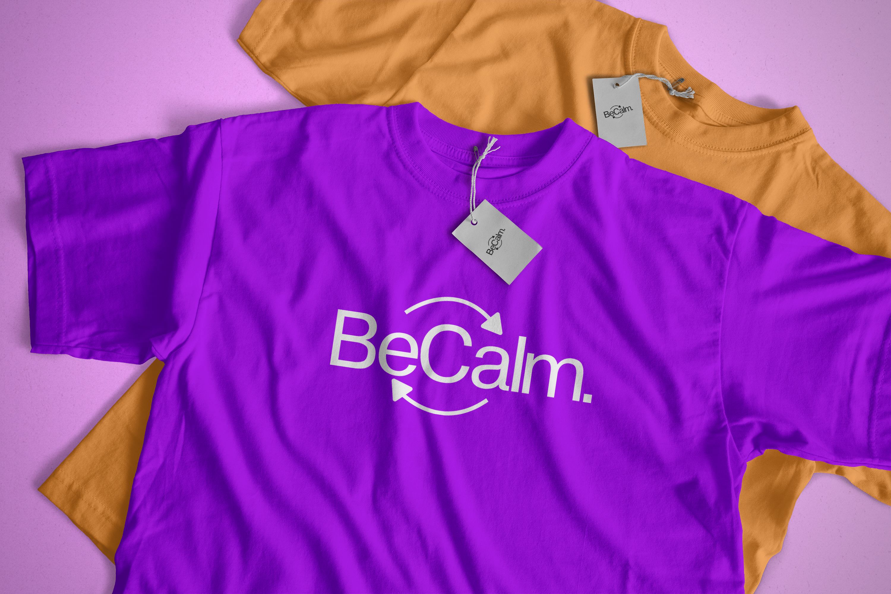
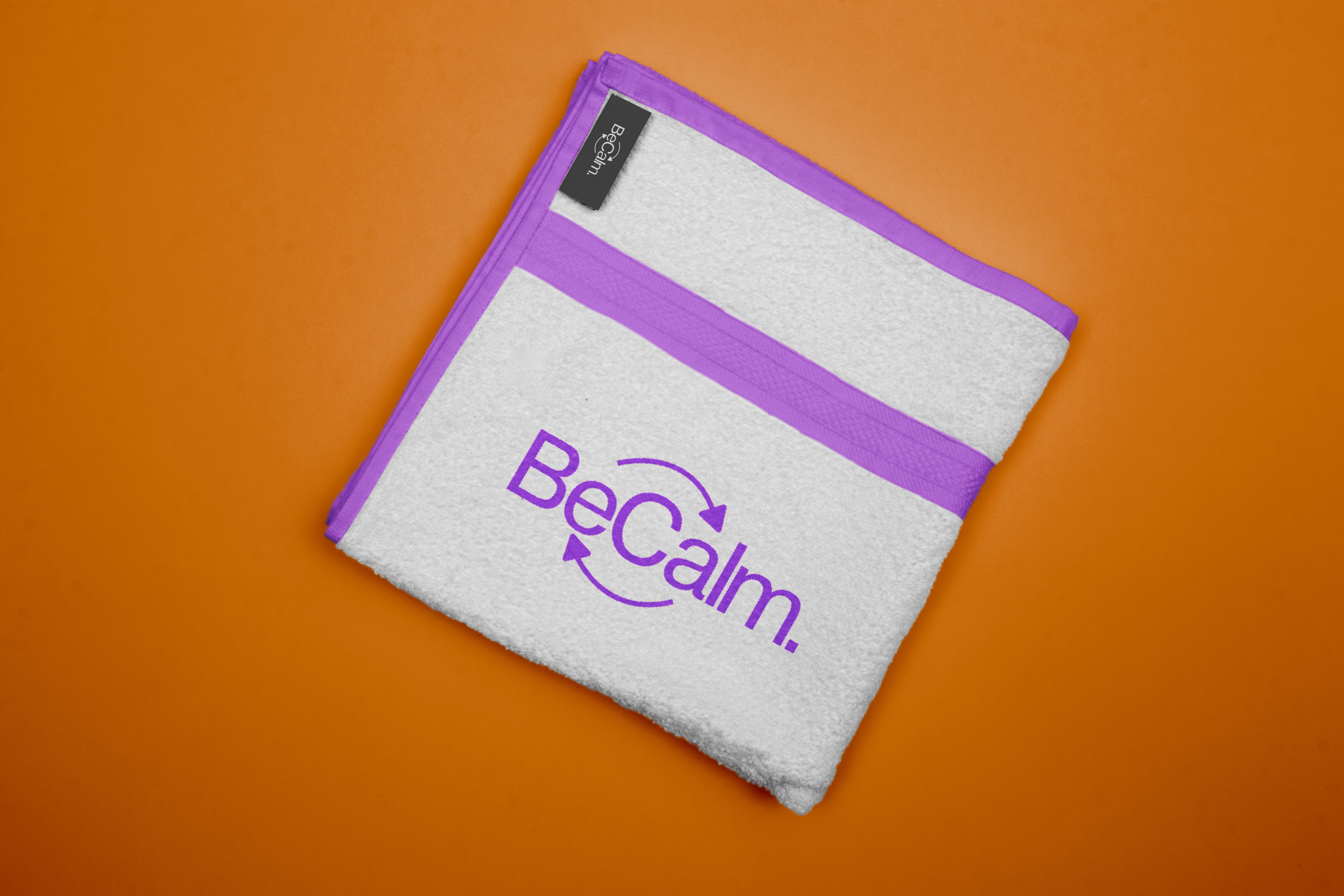
The brand extends into the physical world through a small object lineup — water bottle, t-shirt, towel — each carrying the gradient and the C-mark as a daily reminder to pause. The objects are functional, not gift-shop merch.


Outdoor advertising brings the brand into public space — billboards and posters carry the gradient at full scale. The line — Pause. Breathe. BeCalm. — anchors every surface, from a single bus-stop poster to a full-side building installation.
Pause · Breathe · BeCalm